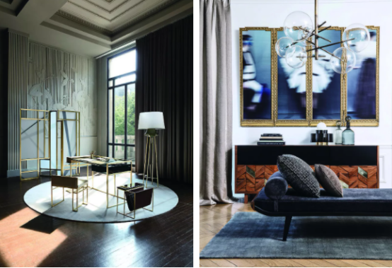
This duplex apartment with an area of 240 square meters has not changed much in the hard decoration. It mainly adopts soft decoration to improve the aesthetic feeling of the whole space and uses diversified details to create a unique and romantic vibe.


Actual View Before Renovation


Structural Drawing & Floor Plan


Living Room


When you open the door, you will see the curved metal partition, matched with transparent glass, which sets the warm and delicate tone of the whole home.

The living and dining room is a horizontal hall layout, which is wide and bright. Each piece of furniture complements the whole space, all understated but in high quality.

The TV background uses stone instead of the original grid design, and is spliced with the metal retaining wall to highlight the layering sense of space.


The V-shaped stone texture is very impactful, eye-catching, and luxurious.


The dark green sofa and black glass coffee table are calm and elegant, neutralizing the cold temperament of the space.
Dining Room

The dining room is equipped with a stone dining table measuring 1.8 meters in length, which is both suitable for a big family and a couple.


The dining sideboard area is accented with a unique grapefruit color scheme, and the mirror decoration invisibly extends the view, along with the pendant chandelier in the shape of pine mushrooms, giving the space a brighter and sophisticated vibe.


Guest Room


The gray headboard hard bag of the guest room condenses a calm texture without fancy shapes or strong colors. It is only decorated with metal hollowed-out headboards, bringing a high-level visual enjoyment in a simple way.


The white custom cabinet is embellished with golden lines, boasting a great texture.
Master Bedroom


The design of the master bedroom follows the life quality that the owner wants, and still adopts a light luxurious design tone.

The background of the bed was redesigned with gray hard bags interspersed with metal lines, echoing the overall hard furnishings. Golden feather wall decorations and leather material bed backs are matched with soft bedding to create a soothing space for sleeping.


The original door leading to the bathroom was designed into an exhibition area. The door to the study was canceled and replaced by lockers and display racks.
Study


The stone surface of the desk highlights the sense of texture, and the unique three-dimensional decorative painting on the wall breaks the monotony of the wallpaper, filling everywhere with a tranquil atmosphere.
Children’s Bedroom


The children’s room adopts bright yellow latex paint and white wave-shaped wall decoration to give the space a warm and playful vibe.


A large number of curved elements, such as the wavy plaster lines on the ceiling, the wavy decorations on the wall, and the chest of drawers with wavy patterns, are used to create uniform and exquisite details.
Recreation Room

The basement floor 1 is a recreational space for the family.

Light wells were opened up and incorporated into the interior. The floor was raised two steps to divide the area, and fire pipes were hidden in the cabinet, making this space a small world for the child.


In the interaction between people and space, the overall color transition tends to be gentle, with clean cabinet colors and metal lines running through the entire basement space to present a modern and simple beauty.

